was studiere ich?
Developed in collaboration with Panatom Studio, was-studiere-ich is a design system, user interface and experience that supports learners across Germany in finding the right field of study. It simplifies complex orientation processes through a modular design system and an intuitive, emotionally engaging interface.
The project combines clarity and accessibility with a distinctive visual language: from a comprehensive design system to a responsive dashboard and guiding companion character, creating a consistent, human-centered experience across all touchpoints.
MY ROLE
I led the visual and interaction design, defining the project’s aesthetic and structural direction from early concept to high-fidelity prototype. This included developing the mood boards, visual language, and design logic; designing the companion character; selecting typefaces and colours; building wireframes and screen designs for desktop and mobile; and establishing the modular design system and its interactive prototype.


Design System
A system-first approach shaped the foundation of the project. Early workshops and testing sessions defined the tone and structure, ensuring every visual decision supported usability and inclusivity.
The result: a cohesive, modular system that can grow with future educational initiatives.


01 Colour
The muted pastel palette creates a friendly and contemporary atmosphere, striking a balance between youthful accessibility and institutional trust. Soft contrasts and bright accents make the interface feel open, inclusive, and easy to engage with.
02 Typography


03 Icons & Graphic Elements
The iconography follows the same rounded, chunky aesthetic as the typography, creating a sense of coherence and familiarity across the interface. Simple in form but full of character, the icons feel approachable and intuitive, echoing the playful precision of the type and supporting clear, friendly navigation.


Graphic elements build on this shared visual language, translating the soft geometry of the icons into larger compositional moments. Through colour and shape, they introduce rhythm and lightness to the layout, ensuring that every part of the system, from type to icon to illustration, speaks the same warm, contemporary tone.


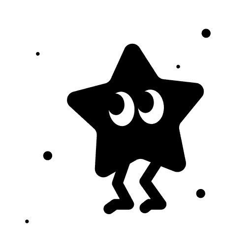
04 Starry
The companion, named Starry, acts as a gentle guide throughout the orientation process. Designed to support users across different age groups, it brings warmth and personality to an otherwise structured environment. Through simple animations and expressive states, Starry can motivate, comfort, or celebrate moments of progress, adapting its mood to match the user’s journey.
Visually, it shares the same rounded, friendly aesthetic as the broader design system, seamlessly integrating into the interface as both a functional and emotional layer.
You can meet Starry right here, click or tap away.


With and for Panatom
05 Methodologies
Rooted in a system-first approach, the process combined research, structure, and experimentation. Each phase, from early testing to refined visual detailing, followed clear UX and UI methodologies to ensure usability, warmth, and coherence across the entire experience.
More Work …

